Dashboard
The dashboard is the heart of your online business. It is the first thing you see when you login and it gives you a snapshot of how your website is performing. The dashboard is the first place you go to check the health of your website.
You can instantly see if your website is growing, and if it’s not then it’s your control centre for investigating where you’re not succeeding and launching changes that will get you where you need to be. From here it provides a summary and allows you to drill in for more information, for those areas of interest or concern.
The dashboard:

This graph shows the amount of revenue generated through online orders over the selected time period. It compares the amount of orders from total visitors and return visitors.
It shows trends over time, what days, weeks and months are the most successful. You can investigate dips and spikes to determine the reasons why.
You can instantly see if your website is growing, and if it’s not then it’s your control centre for investigating where you’re not succeeding and launching changes that will get you where you need to be. From here it provides a summary and allows you to drill in for more information, for those areas of interest or concern.
The dashboard:
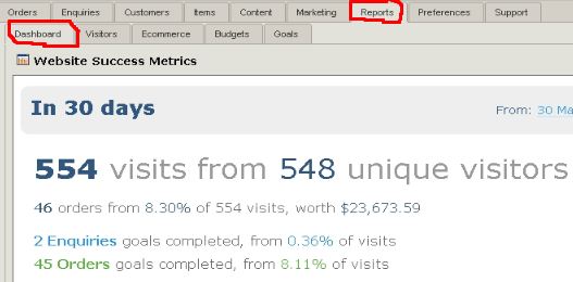
- gives you a quick look at the current status of your website. It presents the most important metrics from the last 30 days, including traffic, orders, revenue, enquiries and goals
- You can change the date range by clicking on the blue ‘From’ or ‘To’ dates in the top right hand corner
- provides the ability to compare the current status with that of the past. It allows you to view trends.
- You can click straight through to the Visitor, Ecommerce and Goal report pages by clicking the link to the right of the page stats.
Notifications
The right hand column of the dashboard presents important notifications regarding the day to day operation of your website. For Ecommerce websites this is especially important, letting you see all your pending orders and enquiries.- You can view your top new orders and order amount and click straight through to them, or open your order tab directly
- You can see all the new enquiries people have made and click straight through to respond.
- The "What's New" lists important features and updates to your Zeald website management software direct from our R&D team. If you have not already, you should sign up to our What's New blog.
Trends
If you’re not studying your past results you will have no way to see if your business is growing. The trend graphs provide an instant birds eye view of your website health over time.If your trends don’t show positive growth it should be obvious the areas that need your attention.
Using the trend graphs
- You should probably be looking at a years worth of data here, so we recommend that you change the date range to 1-year.
- It shows trends over time, what days and weeks and months are the busiest. You can investigate dips and spikes to determine the reasons why.
- You can identity a certain trend on the graph and zoom in on it by selecting that area with your mouse. This gives you more detail about the trend e.g. if you happen to notice a spike in traffic and orders at the time you sent an email marketing campaign - you can tell what affect this had on your business.
- Often these graphs will appear a bit "spikey" and it may be difficult to visualise the trends. In this case you should ‘smooth’ the graph over a number of periods to get a clean view of your trends and find out how the graphs work
Visits
This shows the number of visitors over the selected time period. It compares total visitors with return visitors. The difference of course will be the "new visitors"Goals
This is a graph over time of all your goals together. From this graph you can quickly see:- a comparison of all your goals, you can see which goals are performing best.
- a trend over time for each goal - so which months, seasons and days of the year have worked the best or which campaigns have worked the best.
Revenue
This graph shows the amount of revenue generated through online orders over the selected time period. It compares the amount of orders from total visitors and return visitors. It shows trends over time, what days, weeks and months are the most successful. You can investigate dips and spikes to determine the reasons why.